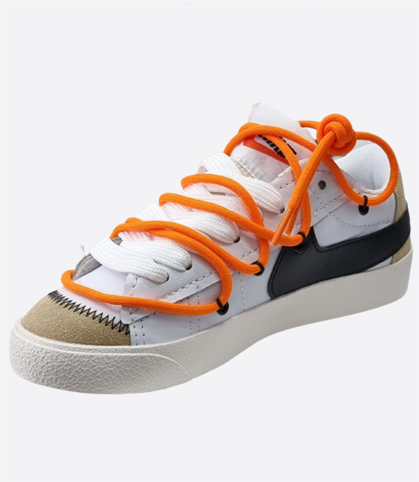
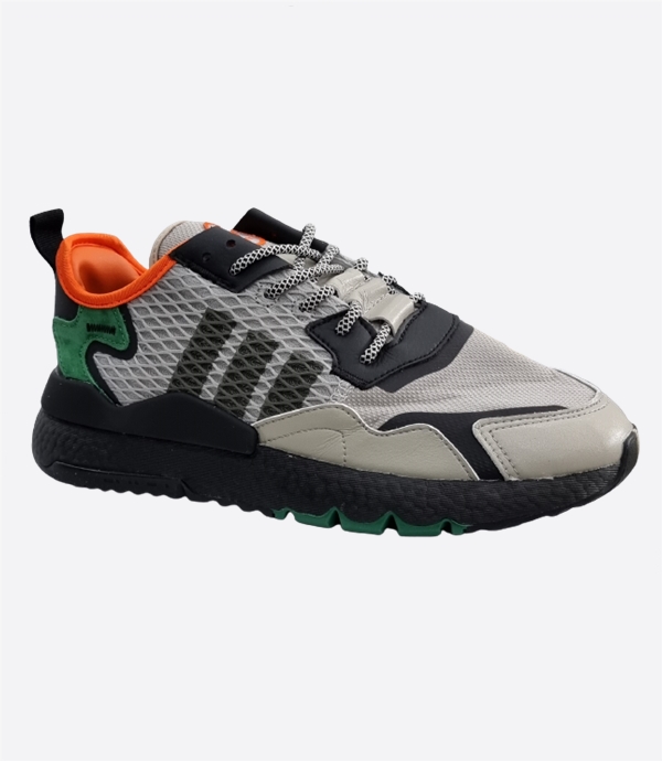
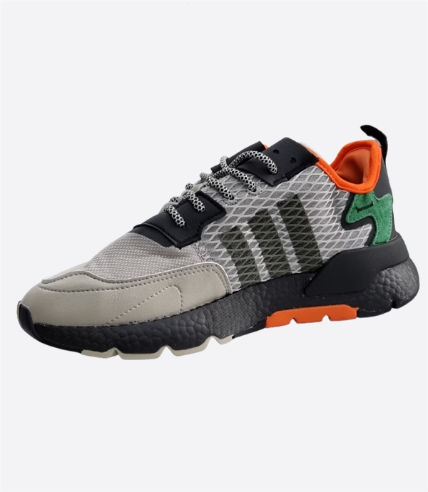
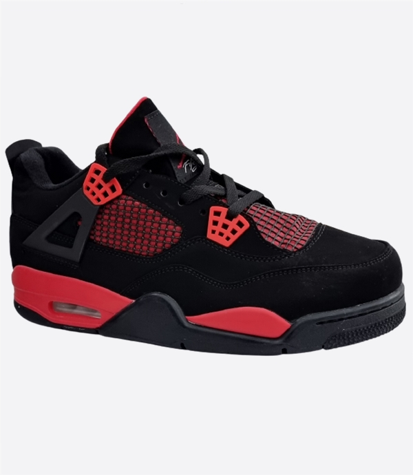
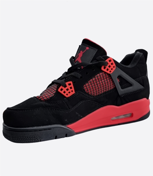
მსგავსი პროდუქცია
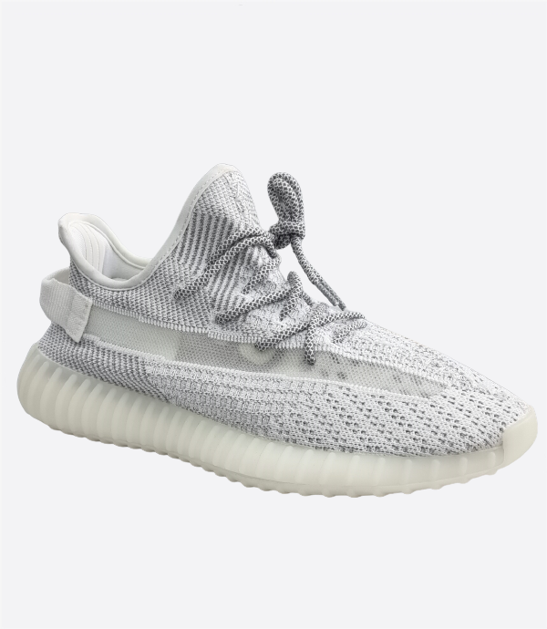
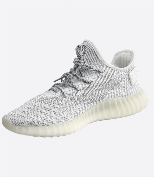
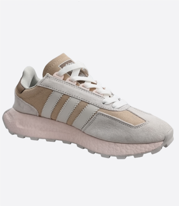
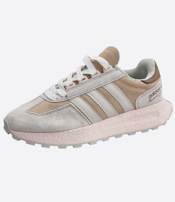
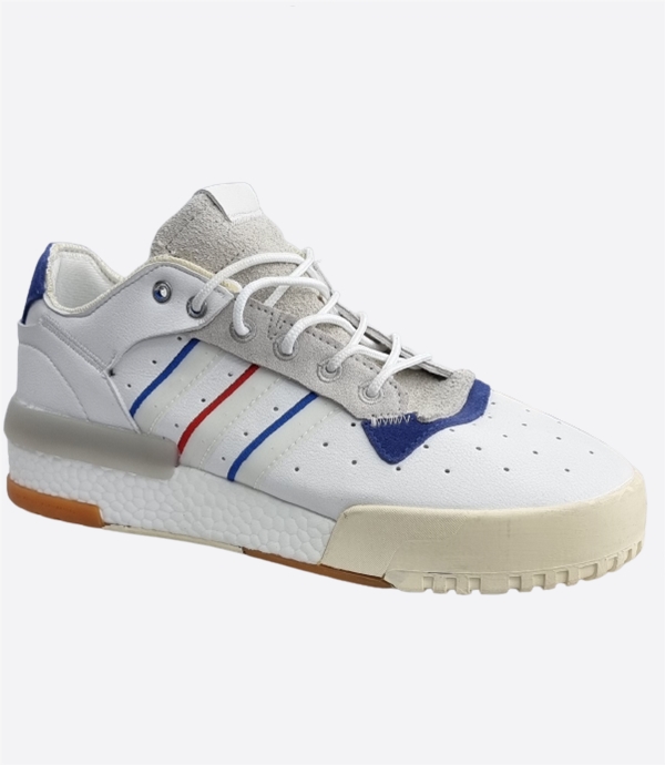
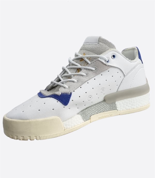
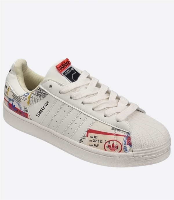
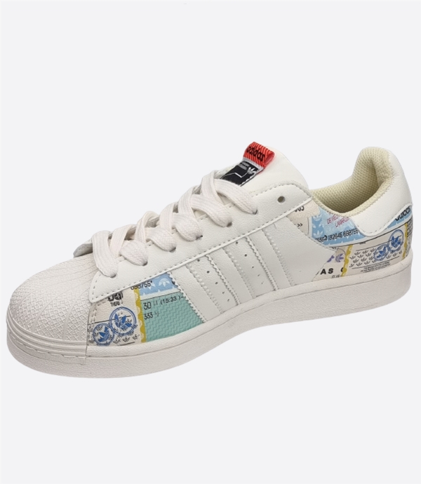
კატეგორია ფეხსაცმელი.
 |
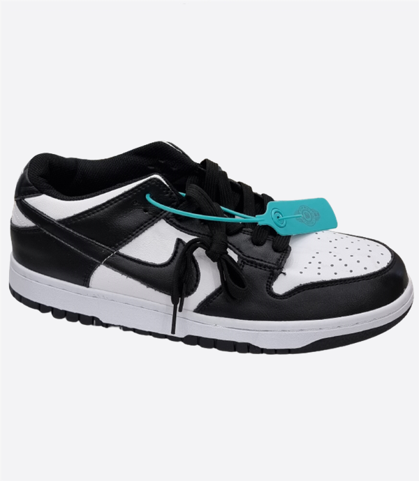
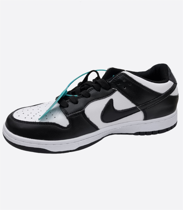
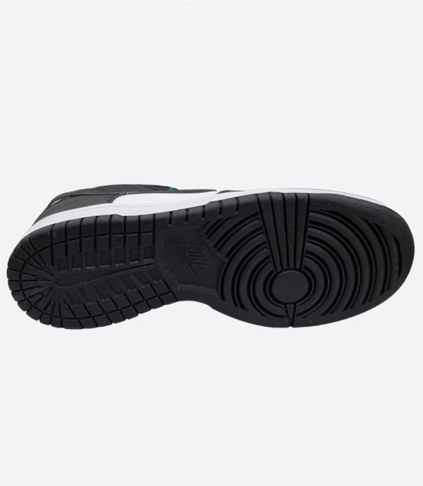

შესახებ
| სეზონი | ყველა სეზონი |
|---|---|
| სქესი | უნისექსი |
| კატეგორია | ფეხსაცმელი |

კატეგორია ფეხსაცმელი.

RandomNameFuesk
2026-04-26 15:05:59
rainharborvendorparlor.shop – Good organization easy navigation helps users find things efficiently today